By Ed Henninger

When I was still working at a newspaper (many more years ago than I care to remember), I showed the cover of a special section to my managing editor. I’ll call him Joe.
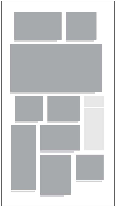
In the bottom left of the cover was a patch of negative space, about two inches square.
Here’s how the conversation went:
Joe: “Why are you showing me something that’s unfinished? C’mon back when the cover is done.”
Me: “But it is done.”
Joe: “But there’s that empty space in the corner there. I guess it just didn’t print right.”
Me: “No, Joe. That’s not empty space. It’s negative space. It’s part of the design.”
Joe: “Oh.” (Long pause). “But what’s gonna go there?”
Me: (Slowly becoming frustrated). “Nothing, Joe. It’s negative space, put there to add to the overall look and feel of the cover.”
Joe: “Ah.” (Another long pause). “So…what are you gonna put there?”
Me: (Remembering to stay calm). “We’re not gonna put anything there, Joe. It’s negative space. It’s part of the design.”
Joe: “Oh… OK. I gotta get to the news meeting. Just let me know what you decide to put in that hole.”
Me: “Sure, Joe.”
So I cleared the cover and it went to press and I waited for Joe to give me a hard time about not putting anything in the negative space.
He never mentioned it.
I tell that story to help illustrate the concept and value of negative space.
Negative space, just like text, headlines, photos and other design elements, is very much an important part of your design – especially on features pages and photo pages.
One of my mantras is: “Negative space creates a positive force.” Often, it’s because of the negative space surrounding elements that the elements receive greater impact.
It’s not just something you haven’t filled yet. It’s space that you purposely place into a design. It’s a positive element. You put it there because it improves the design. It’s an integral part of it. Without that negative space, the design just doesn’t work.
Without proper use of negative space – even in the spacing and structure of inside news pages with ads – packages on the page and elements within those packages would be a crammed, cluttered mess, making it hard on readers to make sense of what’s before them.
On photo pages, many think every inch of space must be filled. Wrong! When we strive to do that, we often crop the photos to fit and that can result in poor cropping and sizing. But if we lay the photos in and use some generous negative space around the outside edges of the page, we can create a package that uses the photos better.
So, don’t be a Joe. Don’t feel like every inch of space must be filled with a visual element.
If negative space is called for … use negative space. You’ll find there’s more “there” there than you thought.
Ed Henninger is an independent newspaper consultant and director of Henninger Consulting, offering comprehensive newspaper design services including redesigns, workshops, design training and design evaluations. Visit www.henningerconsulting.com/ or email edh@henningerconsulting.com